
GoHere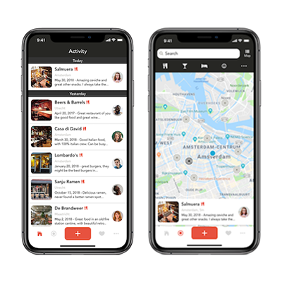
Gohere is a platform to share reviews with friends. They believe that reviews from friends are way more valuable than any stranger. you want your users to trust reviews and find the best places possible all over the world.
The goal of the assignment was to create a more fluent onboarding experience in the Gohere application. In the current onboarding there where big hurdles for the user to climb over. Lots of text and user interactions that scared the user away from using the application.
My role
- Design research
- UX / UI design
- Prototyping
- User testing
Process
To gain insight into what users saw as hurdles I interviewed a group of potential users and asked them how they experienced the onboarding process. The conclusion of the interviews were that users had to take too many steps to get into the app, and they thought of abandoning the app even before getting into the app. I tried to combat these thoughts by creating a clear intent with the login. The focus was to let users create an account and get going with the app. This was tested with potential users by creating a clickable prototype. First in Adobe XD and later in Swift for iOS.
Research
During the quantitative data analysis we noticed that nearly 37% of users abandoned the app within the onboarding process. When we looked more closely we noticed that a lot of people abandoned the app as soon as we asked people to leave a review themselves. To bring to light what happened I interviewed new/potential users of the app and asked people about their experience. The feedback I got was very valuable, people were divided about the login process. The majority understood that logging in was a vital process to see reviews from friends. Some people wanted to see the app before logging in.
The biggest hurdle was asking people to write a review right when entering the app. This had the most negative reaction. What I understood was that people wanted to see other reviews first in order to write one their own. This feedback made us realise that there should be a clear focus when logging in.
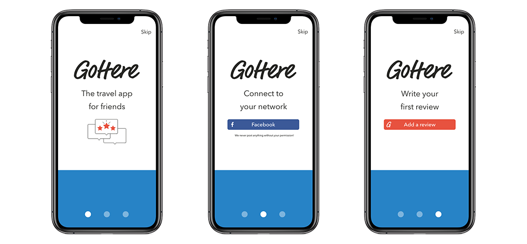
First prototype
The first prototype was not received well by my client and a few things needed to change, the lead developer needed 2 more login options to create a new account and to login with an exciting Gohere account. We also wanted to change the copy to emphasize what kind of app Gohere is.
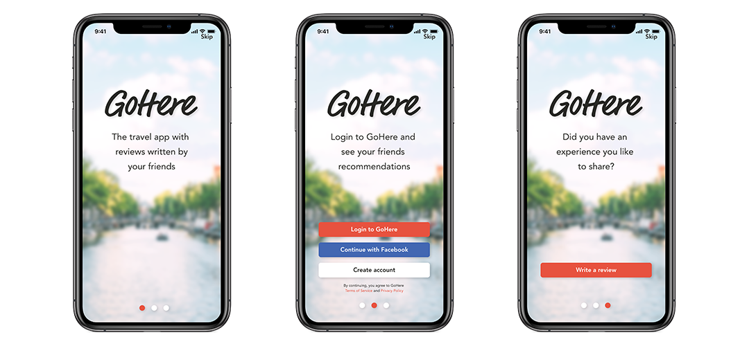
Updated prototype
The second prototype was tested in a controlled environment in the WeWork office in Amsterdam. Here I found a very diverse group of young and adventurous people that either travel a lot for work or for pleasure. I asked people to just experience the onboarding process and asked them questions after.
The test candidates liked the design of the onboarding, it gave them a positive feeling. half the candidates liked logging in with Facebook, the other half wanted to login in a different way. Still the biggest hurdle was not wanting to write a review right away when onboarding the app. The solution to this problem is prompting people later in the app by notification or a banner in the homescreen to add a review.
In app changes
To create a unified feeling from the onboarding to the app itself I designed an updated version of the app. This is also the current look and feel in the Gohere app. For more information check out Gohere.app
 Back
Back